Last week, I published an analysis of the new Boston Marathon qualifying times.
That analysis quite clearly shows that the qualification rate – the percentage of runners in a given age group who run a qualifying time – increases with age. A few age groups in particular – 45-49, 60-64, and 65-69 – had disproportionately high qualification rates.
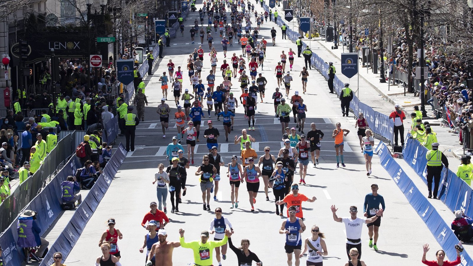
This led me to take a quick peak at the age distribution of the 2024 Boston Marathon, and sure enough – the 45-49 age group was very heavily over represented. I didn’t have time to explore this further at the time, but I made a mental note to come back and look at it more deeply.
As if on cue, when I shared the analysis on Facebook, here’s one of the comments I got:
Given that the older age groups are among the smallest in the field, I wonder if they are applying at the same rates or “self selecting” by a smaller percentage of qualifiers wanting to run Boston. If that is the case, then the question becomes does Boston want it to be equally challenging for each group to apply, or do they want representation of each age group in the race that is similar to representation in races as a whole.
So are the Boston Marathon qualifying times designed to give a handicap to masters runners in order to balance the field and make it more representative?
In a word … no.
And let me preface this by saying that it’s not necessarily a bad thing. I’m not making an argument here about what’s right or wrong. But I think if other people are going to make arguments, then it’s important to acknowledge what’s actually going on.
So let’s take a look at the data and see what it says.
How Does the Age Distribution of the Boston Marathon Compare to All Finishers?
First, let’s take a look at how the overall distribution of all runners compares to the field at the Boston Marathon.
The full dataset includes finishers at American Marathons in the United States in 2023 with 200 or more finishers. There were approximately 400,000 individual finishes, and when I de-duplicated them there were about 350,000 individual runners. The data below is based on the number of individual runners.
The Boston Marathon dataset includes finishers at the Boston Marathon in 2024.
I’m comparing the 2024 Boston Marathon to the 2023 dataset because they are (for the most part) the group from which qualifiers and applicants were drawn for last year’s Boston Marathon.
For each dataset, I calculated the total number of runners in each age group and converted that to a percentage of all runners. The sum total of all of the male age groups and all of the female age groups add up to approximately 100% (other than rounding errors).
The chart on the left shows the distribution of the entire field of runners and the chart on the right shows the distribution of the field at the Boston Marathon.
The age groups are labeled at the bottom, and the colors are there to visually distinguish between men and women. The three dotted lines also call out three larger age ranges – under 35, 35-44, and 45-69.
At first glance, you may notice the difference between the blue and the purple bars. This reflects the fact that there are more men than women who run marathons, and that difference is greater among the older age groups.
But what you want to compare here is the height of each pair of age groups on the left and the same pair of age groups on the right.
For example, of all runners 8.76% are men 25-29 and 7.3% are women 25-29. But at the Boston Marathon, only 4.47% of finishers were men 25-29 and 5.8% were women 25-29. Both of these groups – men moreso than women – are underrepresented at Boston.
If you were to compare each of these age groups, here’s what you’d find:
- Age groups under 35 are under represented at Boston.
- Age groups 35-44 are roughly the same.
- Age groups 45-69 are over represented at Boston.
- Age groups over 70 are roughly the same (and extremely small).
Perhaps the most glaring of these is 45-49.
This age group includes just under 11% of all runners (6.18% men, 4.59% women). But at Boston, this age group comprises over 15% of the field (8.69% men, 6.87% women).
Among all runners, the 25-29 through 40-44 age groups are the biggest – for both men and women. The 45-49 age group is the 5th largest age group. But at Boston, things move in the other direction, with each age group from 30-34 growing – until it peaks at 45-49.
Here’s one final way to summarize things:
- Among all runners, 41% are under 35. But at Boston, only 24% are under 35.
- Among all runners, 30% are between 45 and 69. At Boston, 47% are between 45-69.
What If We Look At Each Gender Separately?
For that first visual, I broke the data out completely. On the one hand, this prevents the gender distribution from being a confounding factor. But it also makes the visual a little more difficult to understand – because the differences in the numbers of men and women can be a distraction.
So the visual below takes the same data, but it breaks it out slightly differently. Here, the bar represents the share of a particular gender made up of a given age group. Women are on the left and men are on the right. The colors distinguish between the runners across all races and runners at Boston.
So when you hover over the 25-29 bars on the women’s side, 17.73% of all women are 25-29 compared to 13.57% of women at Boston.
Within each chart, compare the two bars for each age group. If the “All Runners” bar is higher than the “Boston” bar, that group is under represented at Boston. If the “Boston” bar is higher, that means that age group is over represented.
The pattern is the same, but you can see it a little more clearly.
When you look at the left four age groups, the “All Runners” bar is higher in every case. The disparity is higher on the men’s side, but the pattern is the same for both men and women.
This hints at the fact that women qualify at a slightly higher rate than men. And one might argue that the qualifying time for men under 35 is slightly harder than for women under 35. But again, the age difference is much more influential than the gender difference.
When you look at the middle two age groups – 35-39 and 40-44 – the bars are roughly the same height.
And when you look at the older age groups (45-69), the Boston bar is higher in every case. For both men and women, that difference is about 5 percentage points at 45-49. Beyond that, it stays around 4-5 percentage points for the male age groups and it’s closer to 2-3 percentage points for women.
So the dynamics vary slightly between men and women. But the big picture is clear.
So Is the Boston Marathon’s Field Representative of All Runners?
One thing I didn’t discuss is the overall gender distribution. When you look across the board, the split is approximately 59-41 between men and women for all runners and 58-42 at Boston.
So gender wise, the field is pretty representative.
But when you look at age, it most definitely is not.
There’s likely a combination of factors driving this difference:
- The qualifying times (and cut off times) give an advantage to older runners.
- The youngest runners are less likely to have a long training history.
- Older runners are more likely to have a history of successful training.
- Older runners are more likely to have the time and disposable income to travel for a big race.
With regards to number one, I’ll refer you back to the analysis that sparked this one. I think the data quite clearly demonstrates that the qualifying times are more favorable to older runners and less favorable to younger runners.
With regards to number two, this makes intuitive sense. Marathon performance is built by stacking success and miles over time. But when you look at the average marathon times for each age group, there’s not a huge difference from 20-24 to 30-34.
With regards to number three, this is a common response that I hear. As runners get older, the less successful ones drop out and the more successful ones remain. I plan to dive into this more deeply, but a cursory look at the data shows there is something here. For example, when I compared equivalent times for men 30-34 and men 60-64, the share of the older runners hitting that time was about 2-3 percentage points higher. But this effect is, almost definitely, small.
With regards to number four, it is worth noting that Boston has the oldest field of all of the Majors – other than Tokyo. New York, Chicago, and London are all expensive destination races, and they have far more runners under 40 and far fewer runners over 50. So there’s something special about Boston that isn’t true about the other races.
At the end of the day, I wouldn’t say its fair to blame the qualifying times for 100% of these disparities. There could be multiple explanations. But I would peg that as the primary reason – and the other explanations as being secondary.
Either way, its certainly not the case that the BAA thoughtfully crafted the current qualifying times to ensure that the field at Boston is representative of the age distribution of all runners. If that was their goal today, they have failed. But I have a feeling that was not their primary concern.
Years ago, that may have been the case. It wasn’t until 1990 that the masters age groups got relatively fair qualifying times, and those were loosened up in 2003. Before 1990, it would have been very difficult for a runner in their 50’s – and especially their 60’s – to qualify.
But since then, the pendulum has swung far in the other direction. It is now increasingly difficult for younger runners to qualify, and the Boston Marathon is a race dominated by Masters athletes.
The streaker program definitely lends itself to an older field. I’m on a path to get the streak in large part because I don’t want to always have to worry about a moving unpredictable cut year after year. This year will be #7 for me and I already have a big BQ for 26 which will be my #8. God willing I can keep it going. But the streak takes 10 in a row, no breaks, and there’s almost no way any 20 something is going to have that locked down. I’ve been wondering if at some point the BAA will make some modifications to the program. It grows every year. The drop out rate isn’t matching the drop in rate. At some point it will be too large I assume, but I have no idea what that point is or how far away.
Any case I liked your analysis!
Hi Brian,
I really enjoy your emails and your thoughts on marathoning and Boston. I’ve run Boston 18 times. This year will be #19 and I’ve qualified for #20. I am 56 years old. While I am on the older side and I do have the streak as an advantage, I’ve always qualified by more than the cut off. I know you said the cost of some of the other marathons was a lot, but I have many friends who simply won’t come back to Boston because of the cost. The hotels are very expense. They up the price for Boston. Air is a lot. It all adds up. Once people turn 40 or more they typically have a little bit more money available. Until then they are paying off school loans, raising families, etc. That may be something to think about as well. Those under 30 are often a one and done while those of us who are my age have raised our kids and marathoning is something we do for ourselves. We now have more time and more money to spend on ourselves.
I’m sorry you didn’t get into New York. Good luck with running. Thanks for all of the analysis you do.
Happy Running,
Sally