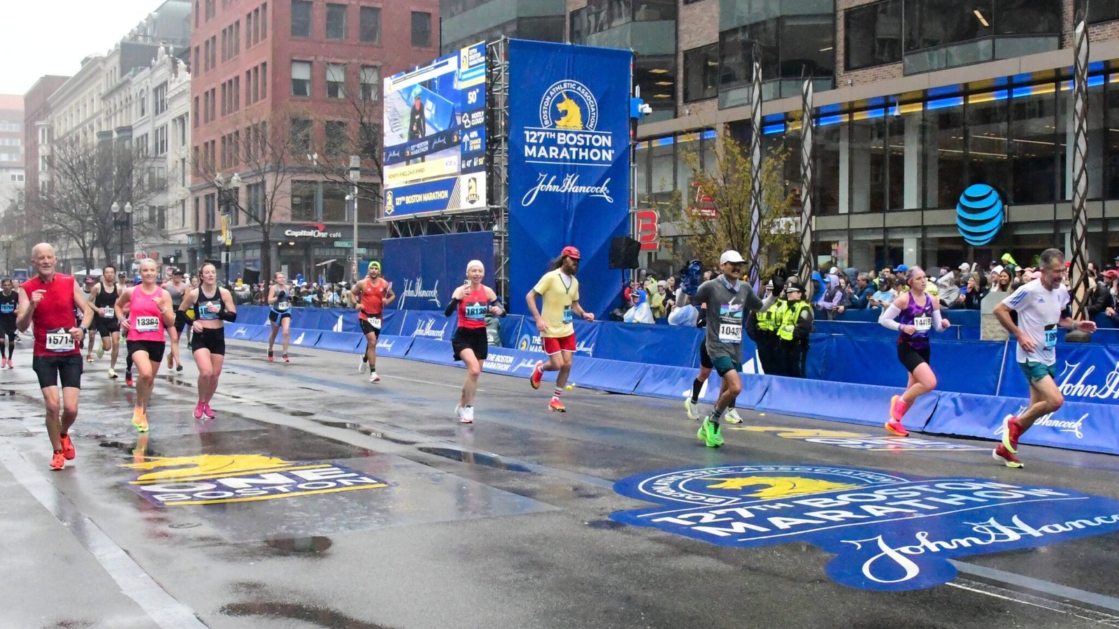
Feature photo by Ania Mendrek on Flickr - CC BY-ND 2.0.
When I first attempted to predict the cutoff time for the 2025 Boston Marathon, I focused on calculating the difference in the number of qualifiers year-over-year. Although not all qualifiers will end up applying to Boston, I started with the assumption that there is a consistent conversion rate between the two numbers. So by tracking the number of qualifiers, I can estimate the anticipated number of applicants.
This worked out pretty well last year, and it’s the same general assumption that the 2026 Boston Marathon Cutoff Time Tracker is built on.
I’ve long wanted to dig a little deeper into what factors contribute to differences in this conversion rate. We have some data from BAA – based on the number of applicants in each bucket of buffers (i.e. 0 to 5 minutes, 10 to 20 minutes). But that’s limited in scope, and there are other factors worth exploring.
Recently, I matched up results from the qualifying period for the 2025 Boston Marathon with results from the actual race. In doing so, I was able to match many runners to their qualifying race. I used that to analyze which races had higher or lower conversion rates.
Today, I want to take another look at that dataset to explore three other factors: age, gender, and buffer.
How does the conversion rate of Boston qualifier to applicant vary along these lines?
How Does Conversion Rate Vary by Qualifying Race
Last month, I took the results from the qualifying period for the 2025 Boston Marathon (9/1/23 to 9/13/24) and compared them with the race results from the 2025 Boston Marathon. You can read more about the methodology in that analysis on Medium, but the end result is a dataset that identifies which qualifiers did or did not actually end up applying to and running Boston.
In that original analysis, I was focused on which races yielded the most applicants to Boston. I was also curious to see how many (or how few) of the qualifiers from some international races ended up running Boston.
Generally speaking, races fell into four categories:
- Races with a very high conversion rate (60% or higher). For the most part, this consists of downhill races and last chance marathons, but some other “regular” races are mixed in. Based on the number of finishers, this represents a very small number of runners.
- Races with a 30% to 50% conversion rate. The bulk of American races fall in this category, including Boston, Chicago, and New York. Based on the number of finishers, this includes an overwhelming majority of runners at North American races.
- Races with a 10% to 20% conversion rate. Berlin and London were closer to 20% and Tokyo was closer to 10%. A handful of other international races fell in this category.
- Races with a conversion rate below 10%. Aside from the Majors and a couple of British races, most international races fell in this category.
On the one hand, this supports my initial assumption that the most relevant races are North American races – and that including large international races would just muck up the numbers with confounding factors.
But it does suggest that some weighting of these factors could help improve accuracy and reliability. There’s an identifiable subset of races with a much higher than usual conversion rate (especially downhill and last chance qualifiers). There’s also an identifiable subset of large races (Berlin, London, Tokyo) with lower – but still significant – conversion rates.
This is some interesting food for thought as I think about a final analysis of the entire qualifying period – and looking ahead to how to track and project things for next year.
Simple Conversion Rate Graphs
Besides the qualifying race, there are three other factors that could be easily identified and may impact a runner’s decision to apply or not: gender, age, and buffer below the qualifying time. Note that for this analysis I excluded the international races with particularly low conversion rates – so we’re looking at the races that are included in the cutoff time tracker.
So let’s start with the basic breakdown of each of these three factors and see how the conversion rate varies.
First up is gender. There’s not a huge difference – 38% for women compared with 35% for men – but there is a difference.
So this could mean that women are slightly more likely to apply. But it could also mean that the other variables relate in some way to gender – and this is masking a difference in other characteristics (like buffer).
It’s also not a huge difference. It could just be statistical noise.
Next up is age. I started by looking at each age group, and there was generally an increase in conversion rate as runners age. There was one outlier – runners under 20 – where the conversion rate seemed strangely high. But in retrospect, it’s likely because some races (including London) don’t report a runner’s exact age, so all open runners are listed as 18 or 19 in the dataset.
I simplified things a bit for this visual, combining the age groups into four larger buckets. The general trend holds, and conversion rate seems to increase with age. There’s also a larger demarcation between 49 and 50 – with the two younger age groups (33% / 35%) significantly lower than the older age groups (40% / 41%).
Finally, here’s the data on buffers.
Based on data released by BAA, we know that conversion rate tends to decrease as a runner’s buffer below their BQ increases. They report the number of applicants in the 0-5, 5-10, 10-20, and 20+ buckets. But this leaves some pretty big buckets at the faster end.
I divided things into more buckets, breaking that faster end of the field into 10-15, 15-20, 20-25, 25-30, and 30+ minute groups. Note that there is no 0-5 minute group here, because the 6:51 cut-off time for the 2025 Boston Marathon meant that no one with a 0-5 minute buffer made it into the race.
The bars consistently go down, indicating a pretty clear relationship between buffer and conversion rate. As a runner’s buffer increases, their likelihood to apply decreases.
Although this relationship doesn’t look like it’s linear. It decreases more rapidly above 20 minutes, and the drop off becomes smaller below 20 minutes.
Intersection of Multiple Variables
By looking at each variable in isolation, it’s possible that one of the other variables is confounding the relationship. So let’s take a look at a few combinations.
This first graph shows the conversion rate by buffer, with men on the left and women on the right.
When it’s broken out this way, the general trend observed above with the buffer remains consistent. Runners with a smaller buffer a more likely to apply than runners with a bigger buffer.
When you compare each bar, the conversion rate for women is consistently a couple percentage points higher than it is for men. So maybe the original graph – showing that women converted at a slightly higher rate than men – is actually showing something.
This second graph also shows the relationship between buffer and conversion rate, but it breaks things out by age instead of gender.
There are three things worth noting here.
First, the general relationship between buffer and conversion rate holds true. Runners with times closer to the BQ are more likely to apply, and runners with faster times are less likely to apply.
Second, there’s still a pretty significant difference between older and younger runners. There’s a slight difference between under 35 and 35-49, and another slight difference between 50-59 and 60+. But there’s a marked difference between the two younger groups and the two older groups.
Third, and perhaps more interesting, there’s a much greater drop off among faster runners who are young than faster runners who are old. This relationship isn’t apparent when you look at either variable in isolation.
How Does Conversion Rate Vary by Gender, Age, and Buffer?
Finally, what if we put all three variables together?
This graph shows the relationship of buffer to conversion rate, with the two colors distinguishing between men and women and the four charts distinguishing between the age groups.
For the most part, this pretty much confirms what was in the three previous charts:
- Conversion rate is highest among runners closet to their BQ’s and lowest among runners with large buffers.
- Conversion rates are higher among runners 50+ compare to runners under 50.
- Conversion rates are slightly higher among women than men.
What Does This Mean for the Boston Marathon Cutoff Prediction?
There are some interesting questions about why these relationships exist that could be worth exploring another day. But for now, let’s just think about how this helps us understand the existing dataset and the current projection of the cutoff time.
Let’s start with the most pronounced trend – buffers. Currently, the number of qualifiers YTD is down by about 6.5%. But when you break it out by buffer, the number of qualifiers with a 0 to 10 minute buffer is roughly equal with last year. The number with a 10 to 20 minute buffer is down less than 6%. The biggest drop is in the 20+ minute bucket.
In other words, the group with the highest conversion rate has a similar number of qualifiers and the group with the lowest conversion rate accounts for the lion’s share of the decline.
Next, consider age. The YTD drop in qualifiers among runners under 50 is just under 8%. The decrease is slightly higher among runners in their 50’s (~9.5%), but the number of qualifiers is up among runners 60+. When you combine the 50-59 and 60+ groups, there’s a net decrease of only 2.5%.
Again, the greater share of the decline is among groups with a relatively lower conversion rate.
Finally, consider gender. Among men, the number of qualifiers is down ~9%. But among women, it’s only down about 3%. Yet another case where the group with the relatively lower conversion rate accounts for a greater share of the decline in qualifiers.
How exactly these factors impact the final projection is a question I’ll leave for another day. I need to play around with the math a little bit to see if these differences are big enough to actually influence the outcome in a meaningful way.
But at the very least, I’d say this is another indication that things are pointing towards a higher cutoff – and not towards a lower cutoff.