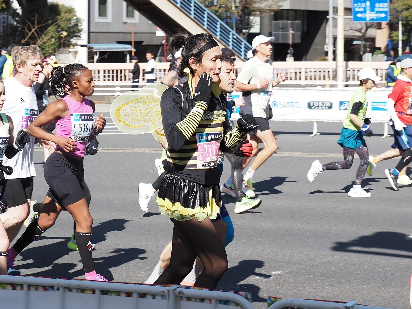
Feature image by nakashi on Wikimedia Commons – CC BY-SA 2.0
.jpg)
Last week, I published an analysis of the 2025 Tokyo Marathon and shared some insights from the data. I collected the preliminary results, including some demographic data and finish times, and came to three general conclusions:
- The race is becoming increasingly international – with the number of Japanese runners on the decline and the number of runners from elsewhere on the rise.
- The race is still overwhelmingly male – although this varies by nationality, and American runners especially have a large number of female runners.
- The overall distribution of finish times is similar to last year, and the heat did not seem to have a big impact on (overall) finish times.
This analysis prompted a decent amount of discussion, and that raised a few interesting follow up questions. So today, I wanted to take a few minutes to look back in the data to see what else we could find out.
Specifically:
- Did the distribution of nationalities vary depending on which corral you were in?
- Did the gender distribution vary depending on which corral you were in?
- How many people ran negative splits, and did this vary at all?
I don’t actually have data on which corral people were in, but the individual results and splits did include the time at which each runner started. That time – from 0 to about 30 minutes – is a good approximation of where each runner was in the context of the entire field.
Most of the visuals below use this as an organizing principle. Runners are sorted into one minute bins – those who started from 0:00 to 0:59 after the gun, 1:00 to 1:59, etc.
So let’s dive in and see what there is to learn.
Do Some Corrals Have More International Runners Than Others?
Conversely, are Japanese runners concentrated in certain corrals?
Although the race is becoming increasingly international, a majority of runners are still Japanese. But on Facebook, two runners responded with very different experiences. One thought that far fewer than half of the field was Japanese, while another one thought it was much higher.
How could they have had such a different experience at the same race?
Another runner chimed in with an interesting bit of trivia. Allegedly, many of the local Japanese runners are grouped into one corral. This could distort the distribution, so that some runners see a lot of Japanese runners and some see relatively few.
But is this true? The visual below breaks the field down into three groups – Japanese, American, and everyone else – and shows their distribution by start time.
I’m not sure where where each corral is, but the distribution is definitely different at different parts of the race.
Up front – the runners crossing in the first couple of minutes – a slight majority of runners are Japanese. But from about 5:00 to 15:00, the share of Japanese runners steadily decreases.
Then there’s a range – from about 16:00 to 21:00 – where almost everyone is Japanese.
If you started at around 7:00, you likely looked around and saw a more diverse crowd. But if you started at 17:00 or 18:00, you’d likely look around and think that just about every runner in the race was Japanese.
This graph shows the same data, but it’s normalized. That means that each bar adds up to 100%, and the colors indicate what share of that group is Japanese, American, or something else. It helps you make comparisons between groups of different sizes.
And this really accentuates the difference. After the first minute, the share of Japanese runners drops to 50% and continues to decline. At 13:00 to 15:00, it’s actually below 20%. But from 17:00 to 22:00, and again at 26:00 or later, it’s 80-90% Japanese.
So where you started could definitely influence your experience of what the field looked like.
Did Some Runners See a Lot More Women?
A similar reaction came from the statistics about women.
On paper, the race is 3 to 1 men. This is typical for Tokyo but atypical for other big races.
But a few runners described having different experiences – some seeing many more women and some seeing many fewer. And also feeling like there was a difference between what they saw in the race and what they saw at the expo.
On the one hand, speed plays a part here. If you’re a fast woman starting near the front of the pack, you’re always going to be running in a group that leans more male. And the small number of women at this race would amplify that effect.
But knowing that the Japanese runners are clustered in certain parts of the field, it’s also possible that the gender distribution is influenced by that. Among Japanese finishers, only about 20% are women. Among other groups, it’s considerably higher.
Here’s a visual similar to the previous one.
If you were a woman who started within a minute of the gun, it would have been pretty lonely. Over the next five minutes, the number of women in each group remains the same (~300), but the number of men decreases, shifting the distribution.
Around 12:00 to 15:00, it’s actually fairly even. Then things start to get a little more uneven in the back half, where there are clusters of Japanese runners.
Here’s a normalized graph.
In the first group, it’s almost 90-10. That declines slowly for the first few minutes to 80-20 at 5:00 to 5:59.
But in the next bunch, it’s closer to 2-1. And there’s a small segment from 13:00 to 15:59 where less than 60% of the runners are men.
In the two areas where the Japanese runners were clustered – 17:00 to 21:59 and 26:00 to 29:59 – the share of women is significantly lower than the surrounding times. So the portions of the field with the highest proportion of men are a) at the front (where the fastest runners are) and b) where the Japanese runners are clustered.
So again, where you happened to start could have a big impact on your experience of the field’s makeup.
Did Runner’s Run Negative Splits – And Did This Vary?
Running a negative split is an aspirational goal for most marathon runners. Your best strategy is to time things perfectly – so you put forth just enough effort in the first half that you can sustain that through the second half and push a little harder at the end.
Of course, this “simple” strategy is very difficult to execute. And most runners end up with a positive split. At other races that I’ve looked at, this has varied from 10% to 20% of the field. For example, 12% of runners at the 2024 Chicago Marathon ran a negative split, as did 22% of the 2024 Philadelphia Marathon.
The percentage at Tokyo was lower – around 7%.
In part this could be the heat of the day taking a small toll in the second half. It could also be a selection effect – since Chicago’s field includes a sizable number of time qualifiers who are (perhaps) more likely to negative split. Philly, which doesn’t have a lottery, also tends to attract a field that’s faster than average.
Since we’ve been breaking things down by starting time, is there any relationship between when a runner started and whether they ran a positive or negative split?
In the visual above, a negative split is any split in which the second half of the race was faster than the first. An “even” split is defined as one in which the second half was less than 1% slower than the first. And a positive split is anything else.
For example, if a runner ran the first half in 90 minutes, a negative split would have been a finish time of 2:59:59 or less, an even split would have been between 3:00:00 and 3:00:54, and a positive split would have been 3:00:55 or slower.
Although the number of runners with negative splits is fairly small, there’s a slightly larger group who ran a relatively even race.
With the change in the number of runners throughout the race, and the small size of the groups we’re interested in, it’s hard to really understand if there are any trends. So let’s normalize the graph and take another look.
When you look at it this way, the runners who started earlier are slightly more likely to run a negative or even split.
For example, the men who started from 0:00 to 10:00 saw about 90% of men with positive splits. Towards the end, that number drifts up to 92% to 95%. Not a huge difference, but if you flip the perspective that means the percent running negative or even splits dropped from ~10% to between 5% and 8%.
For women, too, the percentage running positive splits is lower up front than it is in the back.
For one final look at things, this breaks the men (left) and women (right) into groups according to how big their negative or positive split was. Further to the left is a bigger negative split, and further to the right (past 0) is a bigger positive split.
Besides the fact that many runners saw a large positive split (in excess of 20%), the other interesting trend here is that women trended towards more even splits than men. The big difference is in the range of small to moderate positive splits.
For example, 8.2% of women had a 4% to 6% positive split – compared to 6.6% of men. As you move to the right, each bucket of women is larger … and the default bucket (> 20%) includes 37.3% of men but only 23.1% of women.
For someone who started out on track for 4:00, a 20% positive split would be a 4:24 finish.
This is consistent with some other races that I’ve looked at which suggests that women tend to run more even or negative splits than men – or conversely, that men may be more likely to blow up and end up with a positive split.
I’ll let you theorize about why that is. But for now, there’s the data.
The Tokyo Marathon Was the Tale of Two Races
Ultimately, I think this all combines to suggest that the 2025 Tokyo Marathon was a tale of two races – in a number of different ways.
On the one hand, where a runner started dictated how the field looked. It also correlated to how likely a runner was to run a negative or even split. And by extension, we might deduce that runners who started earlier and finished faster felt fewer effects of the weather – and avoided the issues at the water stops.
Conversely, the runners who started later and finished slower ran into the heat of the day. And they got to each water stop after 30,000 other runners … and were more likely to be met with a shortage of cups and hydration.
It’s a good reminder of why anecdotal evidence is not a good way to gauge the bigger picture. If you took ten different runners from ten different parts of the field, they may have described ten very different experiences. But until you combine them all and layer on the objective data, it’s easy to lose the forest for the trees.
As I was wrapping up this post, I checked the Tokyo Marathon website and they have released the official results. These results include age data, and I’ll be combining that with the existing data that I’ve already collected.
I’ve taken that data and finished my third and final analysis of this year’s Tokyo Marathon – a look at how many runners qualified for Boston and how the results compared within age groups between last year and this year.