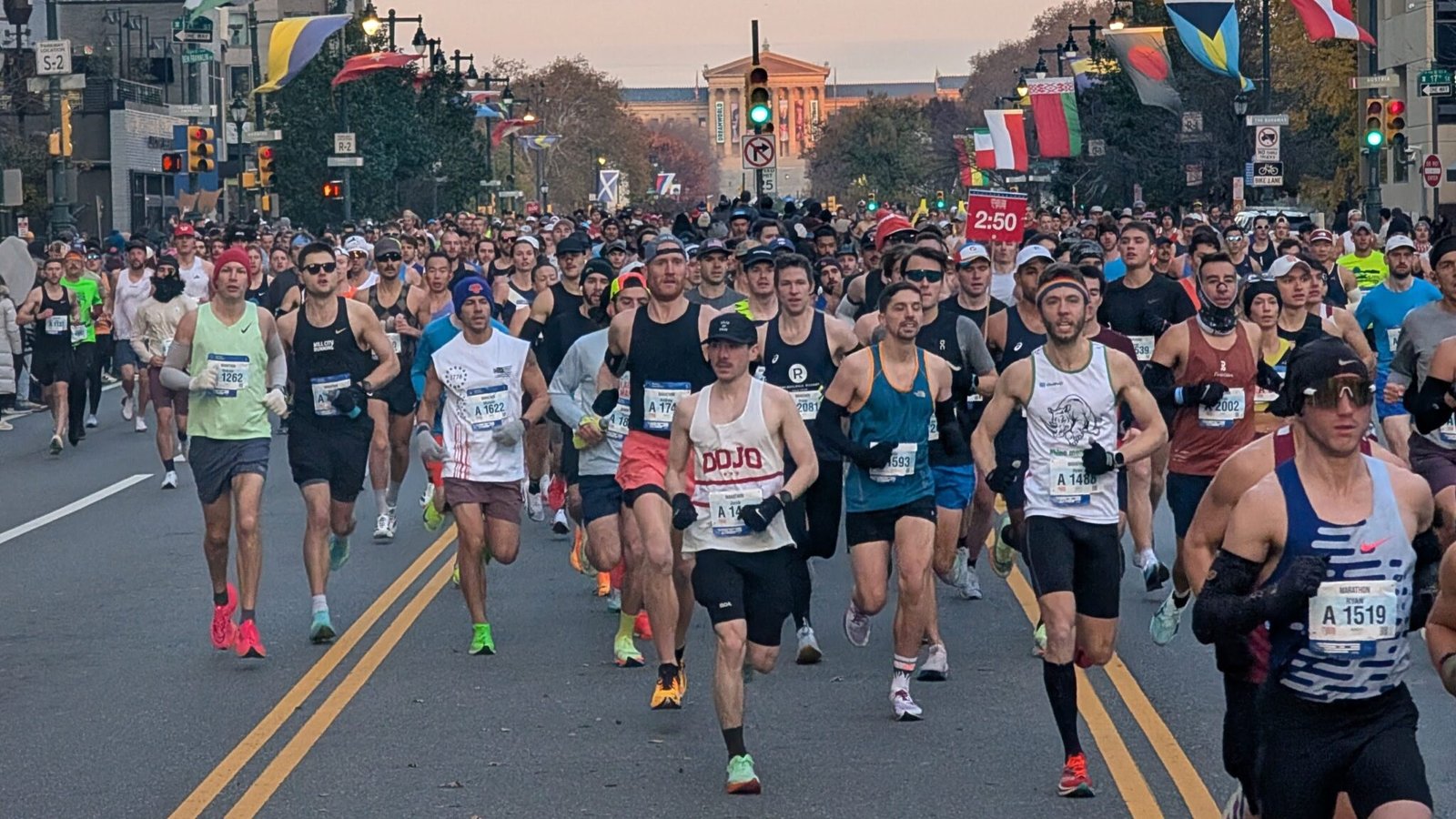
Last weekend was the Philly Marathon. The last few years, the race has had over 10,000 finishers, and it’s once again one of the largest races in the country. I ran the race back in 2022, and it also happens to be one of my favorites.
Although I didn’t run the race this year, I’m typically in the city on race weekend. It’s the opening weekend for the Christmas display at Longwood Gardens, and Saturday is the opening night for the Christmas Village in Philadelphia. It’s become a holiday tradition for our family – with the added bonus that I get to wake up and watch the marathon on Sunday morning.
Last Sunday, I woke up early, went for a quick jog to warm up and then watched the start of the race. For the next two hours, I jogged around, stopping at various points along the course to cheer on the runners. And when I got home, I was excited to dig into the data.
A few questions we’ll explore below include:
- How big was this year’s race, and how does this compare to recent years?
- Where are the finishers from?
- How fast was this year’s race compared to last year?
- How many runners managed a negative split?
Let’s get to it.
How Has the Field Grown and Changed?
For the last few years, Philly has been selling out and returning to its former glory. Just how big was it this year?
The visual below shows the number of finishers each year going back to 2000. The colors indicate the split between men and women.
This year, the race sold out earlier than ever – in early July. Last year saw record levels of participation, and this year was even larger. The number of finishers was up slightly to 12,598 (including 302 who didn’t disclose their gender).
Other than last two years, Philly hasn’t had nearly this many finishers since its peak back in 2012.
Another trend that’s noticeable here is that the number of women in the race is increasing. Immediately after COVID, the race leaned more heavily towards men than usual. But in the last two years, things have shifted in the other direction.
41% of the finishers this year were women, and the total number of women was almost at a record high. This year’s total (5,146) is only 20 below the previous peak in 2012.
When you break the data out by age, the last few years have seen a continued surge in participation among younger runners. The masters age groups are all a similar size or smaller than they were ten years ago, while the younger age groups have grown significantly.
This year in particular, though, most of that growth came on the women’s side. The younger men’s age groups are all similar to 2024, but the younger women’s age groups all grew by quite a bit.
Overall, this race is a good example of how the current running boom is being powered, in large part, by runners in their 20’s and 30’s.
Where Are They From?
Philly is a big race, with well over 10,000 runners. But it’s also a regional race that’s powered by locals.
The results don’t include a country the runner is from. But based on the state information provided, it’s possible to infer how many runners are coming from outside the United States: 336 out of 12,262. Only about 2.5% of the finishers this year were international, and most of them are from the Quebec and Ontario area.
Of those 12,000 runners from the United States – most are from states that border or are close to Pennsylvania. The most common state is (unsurprisingly) Pennsylvania – followed by New York, New Jersey, Massachusetts, Maryland, and Virginia. And there’s a big drop off between New Jersey (~15%) and Massachusetts (~6%). About two thirds of finishers came from PA, NY, or NJ.
The results also include each runner’s zip code, which makes it possible to map with some precision where the finishers are. I broke out the top three states below.
About 4,400 finishers came from Pennsylvania. The colored areas show where the runners are from, with the darker areas indicating more finishers in a given zip code.
The majority of these runners are clustered around Philadelphia in southeast Pennsylvania. The two most well represented zip codes, with over 200 runners each, are both in Philly (19130 and 19103). There are a few smaller clusters including Lancaster in the southeast and Pittsburgh in the southwest. The spot in the dead center of the map is State College.
New York also has a few clusters spread throughout a vast, empty state. Many of the runners are from New York City or the surrounding suburbs. Outside the New York City area, the darkest zip code is in the center-west area – Ithaca. There’s also a cluster up north around Albany.
Otherwise, like Pennsylvania, much of the state is blank.
The map of New Jersey looks different. Maybe it’s because the state is so densely populated, but there are fewer empty areas. About 1,800 runners – similar to New York – come from New Jersey, but they’re packed into a much smaller area and mapped across a smaller number of zip codes.
Still, there are some more heavily represented clusters. There’s a big cluster in the Philly suburbs in Camden and Burlington County. But there’s also a decent chunk of runners from Princeton and the surrounding suburbs.
It’s hard to make out on the map, but the most well represented zip code is Hoboken, just across the river form New Jersey. A decent number of runners come from the rest of that area, as well.
This makes me curious to take a closer look at the geographic distribution of finishers at other big marathons like Chicago and New York. I’ve never really looked at it beyond the state level, but mapping it is really interesting. There seems to be heavy clustering in urban and suburban areas, with the more rural areas of large states like Pennsylvania and New York less well represented.
How Fast Were This Year’s Finishers?
Philly isn’t often considered a fast race. When you ask that, people are quick to mention that there are some hills. But the hills throughout the course are minimal, and the race does attract some fast runners. So it’s not a particularly slow race, either.
How fast were this year’s finishers?
I just published an analysis of how common sub-3:00 marathons are, so that seems like a good place to start. The visual below summarizes the share of finishers who finished sub-3:00 in the last ten years.
The left half of the graph shows the overall share of runners – 4.79% this year – who finished sub-3:00. The right half isolates the younger male age groups which are more likely to run under three hours.
Regardless of the group you look at, the trend is similar. It increased slightly in 2018-19, jumped significantly in 2022-23, and then it tanked in 2024. I also noticed last year that the number of BQs at Philly was lower than expected.
In retrospect, the weather may not have been great in 2024. I was in the city last year, and it didn’t initially occur to me that anything was off. It certainly wasn’t hot. But it was pretty windy, and that may have had an impact. Certainly something did.
Regardless, this year the numbers rebounded pretty well. Of the younger men, 9.17% finished under three hours – which is about typical if you look across all marathons.
For a more holistic view of the field that includes other age groups, the number of Boston qualifiers is a better measure. The visual below summarizes how many people qualified in each age group last year and this year.
The three biggest age groups are 30-34, 35-39, and 25-29. On the men’s side, these saw substantial increases in qualifying rates. On the women’s side this increased for runners in their late 20’s and early 30’s.
Oddly enough, the masters women saw fewer qualifiers this year. But these age groups are also fairly small, so that could be a function of some outliers.
Across the board, the number of qualifiers increased significantly year over year.

How Many Runners Negative Split the Race?
Something I’ve looked at with other races this fall is how many runners achieved negative splits. In Chicago, the overall share of finishers running a negative split was about 11%, and in New York it was about 7%.
What about Philly? The overall rate of negative splitting was 23.7%. Much higher.
If you look at the elevation profile of the course, it makes sense. It’s not a super hilly course, but the biggest hills all come before the halfway point. The second half of the race has a slight negative drop, and otherwise it’s mostly small rolling hills. So if someone runs a good first half, they’re set up well to run a faster second half – and negative split.
When analyzing the other races, I noticed two trends:
- Women tended to negative split more often than men and they were less likely to blow up.
- Faster runners were also more likely to negative split and less likely to blow up.
The visual above breaks the field into buckets, based on whether they ran a negative split or a positive one. For positive splits, the percent indicates how much slower the second half was than the first half. A 25% positive split means that the second half was 25% slower – a 90 minute first half followed by a 112.5 minute second half (and a 3:22:30 finish). So that’s a pretty big blow up. The time on the x-axis indicates how fast the runner completed the first half of the race.
Both trends are at play here, too. At most paces, women are slightly more likely to run a negative split. And on the right half of the graph, men are less likely to fall into the 0-10% group (slight positive split) and much more likely to fall into the 25-50% group (a huge positive split). There are hardly any women with a 25% positive split.
Across both genders, the rate of negative splitting decreases after the 1:45-2:00 mark – and the share of runners with bigger splits increases.
For a more fine grained understanding of runner’s pacing throughout the race, take a look at the graph below.
This visual uses the individual splits throughout the course to estimate their pace over each segment. The label – i.e. 5k – indicates how much faster or slower their pace was in the that segment (0 to 5k) compared to their overall average pace. Note that there was no 35k split, so the 40k bar relates to their average pace along the entire segment from 30k to 40k.
The graph is also segmented by average pace – from the fastest runners (3:00-3:59/km) to some of the slowest runners (8:00-8:59/km).
For the faster runners, they started out slightly fast and improved their pace through the 15k mark. Then, the trend reversed. But as a whole, they were still running faster than their average pace until the 30k mark. It’s that last segment – out and back along Kelly Drive to Manayunk – where these runners start to really slow down.
Among the slower runners, though, the trend looks a little different. The slowest runners are fastest in their first split, and they get progressively slower after the first 5k. Among 6:00/km runners, their pace turns positive between 25k and 30k. Among the slower runners, it turns positive even earlier – between 20k and 25k.
Interestingly, the first big hill is between the 10k and 15k mark, as the course heads up towards the zoo. But there’s little evidence here that runners are slowed down by that hill – at least not with enough magnitude to impact their split across a full 5k. Judging from the fast – and successful runners – the hills in the middle of the course don’t need to slow you down very much.
The Bottom Line on the 2025 Philly Marathon
As always, I had a great time in Philly. It’s a big city race, and the crowds don’t disappoint. Not to mention the historic scenery and the fast field.
After selling out earlier than ever, this year turned out to be the biggest field in Philly history – by a slight margin over last year. The race has probably reached it’s logistical limit, and I doubt it’ll increase much in size from here.
After a few years in which the race was becoming more male dominated, this year trended towards more female participation. It also continued a trend – seen nationwide – towards younger runners. In the case of Philly, many of these runners came from urban and suburban centers in nearby states.
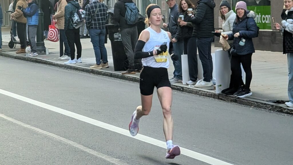
This year was faster than last year. A higher proportion of the field finished sub-3:00, and a higher proportion of the field qualified for Boston. Anna Oeser won the women’s race in her debut marathon, and her 2:34:55 was good enough for an OTQ. On the men’s side, the top American came through in 2:16:04 – Kristoffer Mugrage just missed the new OTQ standard and joins a growing group of men who ran between 2:16-2:18 this year.
Finally, a much higher proportion of the field at Philly runs negative splits than at either Chicago or New York. This is likely a function of the elevation profile of the course – with a few small challenges early on. But otherwise, the patterns evident in other races are also evident here – with women more likely to run negative splits and men and slower runners more likely to blow up.
If you ran the race, how did your morning go? And if you haven’t – what are you waiting for?