A couple years back, I wrote an article about how finish times across different race distances can highlight a runner’s strengths and weaknesses. I used a particular runner’s post on Reddit as an example to highlight how with a relatively weak half marathon time – compared to predictions based on shorter events – would also fail to realize “equivalent” race times in the marathon.
I also built a tool to help visualize this. It was a simple app in Streamlit that took a few race distances as inputs and generated a chart of equivalent race times.
It worked, but it had some limitations. Streamlit in particular had some issues, and the app would often crash and have to be restarted. It’s been on my to do list for some time to redo this, but I just haven’t had the time.
The benefit of Streamlit was that I could write the code in Python – a language I’m very familiar with. However, this kind of app would work just as well (or better) if written entirely in Javascript. It only relies on user input, not stored data, so there’s really no reason to call some kind of external app.
Recently, I’ve been playing around with some of the AI coding tools in Gemini and this seemed like a good opportunity. I already had a working prototype and I knew exactly what I wanted as an end result. What I really needed was to convert the code to pure Javascript and embed it directly in the WordPress page.
Long story short: it worked. I ran through a few iterations yesterday and I updated the page to include the new version of the tool. You can check it out here.
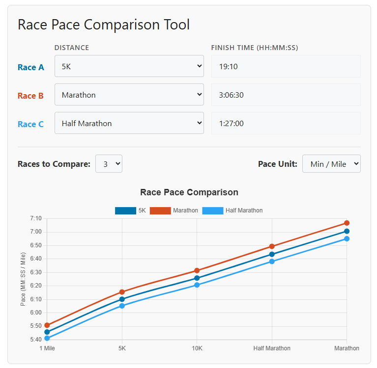
The screenshot above is what the app looks like. You can enter anywhere from two to five race times, using either standard distances or a custom race distance. The equivalent times for each performance are plotted on the graph, and the lowest (fastest) line shows your strongest performance.