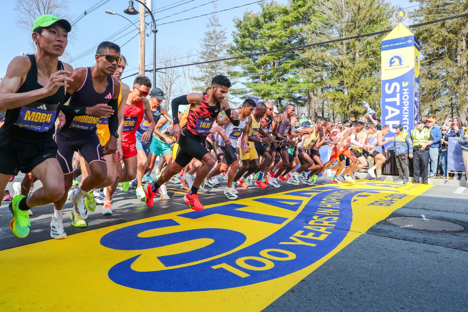
The weather at this year’s Boston Marathon was warm – not crazy hot, but warm enough that it had a negative impact on runners’ performances.
In conversations around the race, I heard a claim that piqued my interest – the heat had a worse impact on runners coming out of the winter. For many runners, this would be one of their first warm days of running.
This then made me curious – do runners from warmer climates fare better on hot days at spring marathons?
It makes intuitive sense. Runners who are used to the heat are more acclimatized – and likely won’t suffer quite as much from mild heat. But we can do better than intuitive sense. We can dig into the data to see if there’s any actual evidence.
I collected some data, performed some analysis, and shared it in three ways:
- A public dataset on Kaggle
- A dashboard and a series of visuals on Tableau Public
- An analysis and explanation on Medium
An Brief Explanation of the Data
You can check out the dataset on Kaggle for a more thorough explanation of how the data was sourced and to interact with it directly.
But the dataset includes the following:
- Demographic information about the runners (gender, age, zip code)
- Official splits for the first and second half of the race and a calculation of each runner’s positive split
- Two weeks of weather data (min temp, max temp, and mean temp) for each runner’s zip code
If you’re not familiar with Kaggle, it’s a place to share datasets and code for data analysis and data science.
You can download the dataset as csv files to work with it locally or use their system to develop code in Python or R to work with the data. I created a Notebook on Kaggle to load the data and perform some analysis – so you can fork that to get started.
Exploring the Data on Tableau
For the less technically savvy, you can also use Tableau to explore the data.
Before uploading the dataset to Tableau, I aggregated the individual daily weather data into averages. So each zip code has an average min, max, and mean temperature. I also counted the number of days each zip code experienced a day with a min temp above 55F.
You can interact with a number of visuals including:
- A map of min temps by zip code
- A table with the number of finishers broken down by temperature, age, and gender
- A scatterplot comparing speed in the first half to positive split
- A scatterplot comparing average min temp to positive split
- Bar charts comparing positive splits for cool and warm weather runners
If you’re proficient in Tableau, you should also be able to download the full dataset and create your own workbook and visualizations.
The Analysis on Medium
After exploring the data, I prepared some visualizations on Flourish and wrote up a piece to explain the analysis. This was published on Medium in Runner’s Life: Do Runner’s in Warm Climates Do Better in Hot, Spring Marathons?
The article is behind Medium’s paywall, but the link should get you behind the paywall for this article.
The article starts by laying out the premise:
- It was warm at this year’s Boston Marathon
- Some parts of the country were cold in the weeks leading up to the race, while some parts of the country were warm
- Athletes from warmer areas should have performed better in the race
The conclusions, in brief, were:
- In early April, average minimum temperatures across the country ranged from below freezing to the 60’s.
- The majority of runners live in places where min temps were in the 40’s or below. A smaller group of runners lived in warm areas, chiefly Texas and Florida, with temps in the 60’s.
- There is a relationship in the data between a runner’s speed and the percentage change in their pace from the first half to the second half. Slower runners slow down more.
- There is no consistent or clear relationship in the data between temperature at home and change in pace.
In other words, the data does not support the conclusion that runners from warmer climates fared better in this year’s Boston Marathon than runners from cooler climates.
Some possible explanations for this include:
- The warmer climates may not have been warm enough to induce strong heat acclimatization.
- The groups of runners in warm climates may have been too small to produce reliable distributions.
- The data used to quantify a runner’s success or failure (change in pace from the first half to the second half) may not have been the right choice – or there may have been too many confounding variables to see the relationship between it and temperature.
What Are Your Thoughts?
Have thoughts you’d like to share?
Leave a comment below – or join the discussion on Kaggle (about the data) or Medium (about the analysis).
If you have the technical know-how, I’d encourage you to dig into the data on Kaggle and conduct your own analysis. Part of why I write about marathons – and why I collected and prepared the data in this way – is that I find there’s often a dearth of good data-driven analysis.
By collecting and sharing the data, I’m hoping others can and will produce quality analysis from it. If you do publish something of your own, please link back this page and let me know about it so that I can check it out.
I’d also encourage you to sign up with the form below. I send out a weekly newsletter that always includes a piece of marathon related data analysis.